A UI/UX design agency whose work survives all the way to production
We design digital products from user flows to design systems and motion, and the same team builds them — so what you approve in Figma is what your users actually get.
At Paradise Code, UI/UX design is part of product engineering, not a separate phase whose files get thrown over a wall. Designers and engineers work together from day one, so every screen is designed with real data, empty states, errors and loading in mind, and every visual decision respects technical constraints — performance, accessibility and how components will actually be built in React.
A template or a generic UI kit is fine for getting started quickly. As a product grows, though, each new screen drifts a little from the last and design debt piles up. A design system fixes that with tokens for color, type and spacing plus documented components. For Valira we built the «Atelier 2036» design system, with visual QA, which maps straight to code through Tailwind and shadcn/ui.
For Persian and Arabic products, RTL design is more than mirroring a layout. Directional icons, numbers and dates, mixed right-to-left and left-to-right text, and a typeface that joins letters correctly all have to be designed in from the start. When it serves the product, we also build 3D web experiences with three.js and restrained motion — this very site is an example.
What we build
UX design and user flows
Journey maps, information architecture and wireframes grounded in what users actually do, before a single color is chosen.
Web and app UI design
Precise interfaces for web, Android and admin panels, covering every state: empty, error, loading and dense data.
Design systems
Tokens, components and docs in Figma and code — like «Atelier 2036» for Valira, with visual QA and a Tailwind plus shadcn/ui implementation.
RTL and multilingual design
Correct right-to-left layouts for Persian and Arabic alongside English, with proper type, numerals and directional icons.
3D web design and motion
three.js scenes and animation that carry meaning, built to a performance budget and respecting prefers-reduced-motion.
Landing page design
Pages with a clear message, visual hierarchy and conversion path — fast, crawlable and measurable.
How we work
- 01
Understand users and the job
We talk to stakeholders and, where possible, real users, review competitors, and rank the jobs users need done.
- 02
Wireframes and prototypes
Flows are tested in low-fidelity wireframes and clickable Figma prototypes, while structural changes are still cheap.
- 03
UI and design system
We lock the visual language on a few key screens, then turn it into tokens and components, in both RTL and LTR.
- 04
Build and visual QA
Components are built in React and checked against the design so spacing, states and motion stay faithful.
Related work
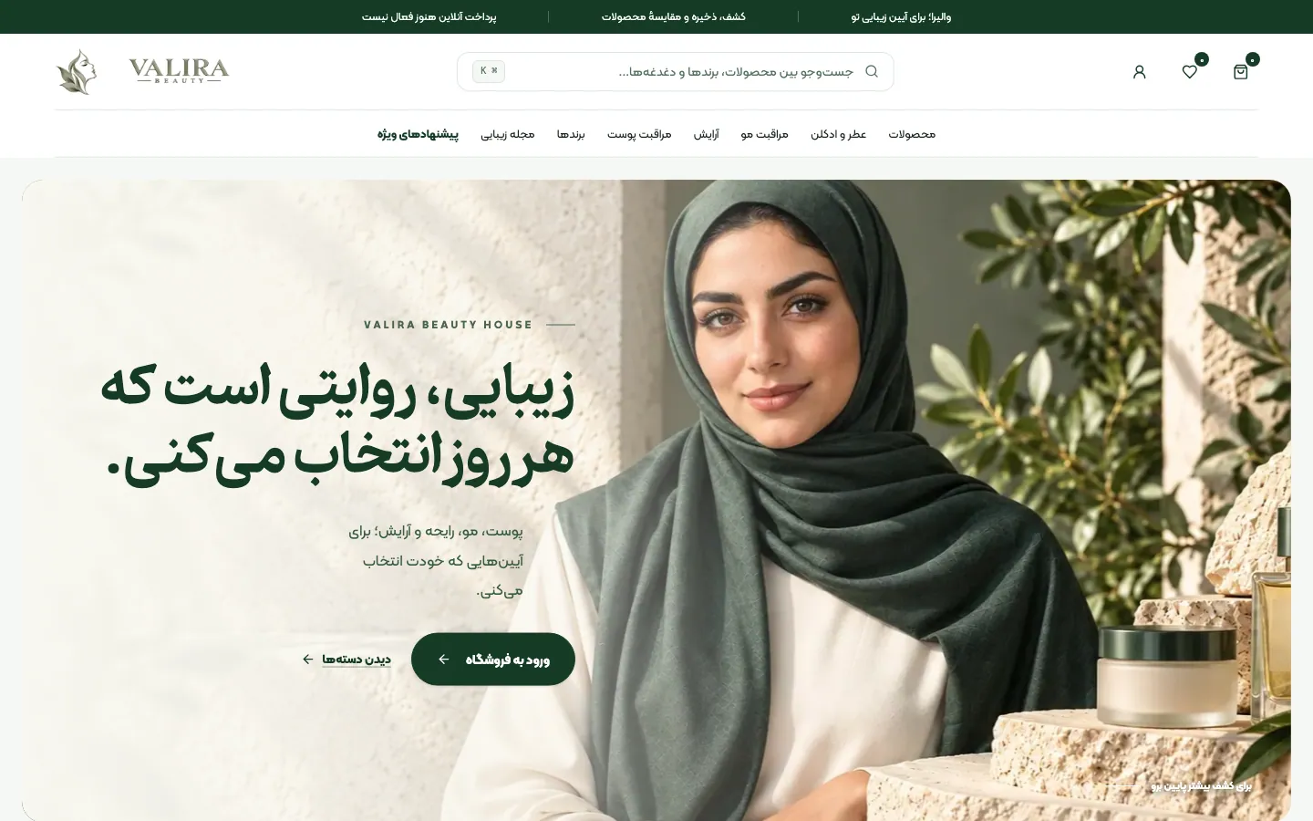
Valira Beauty
Your beauty ritual.
- Online store
- Web app or website
- Product design
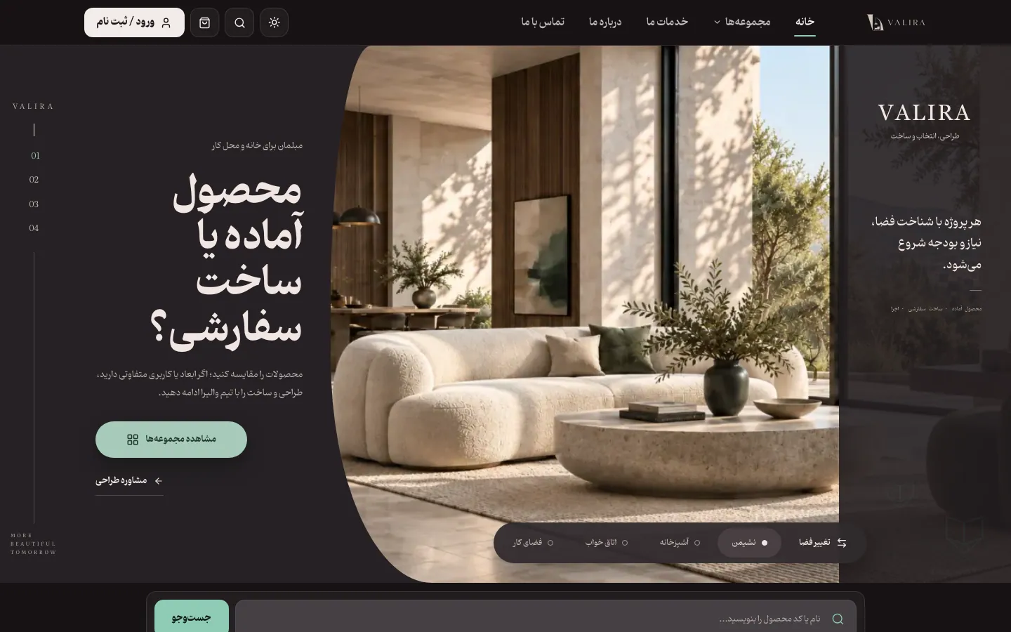
Valira
From choosing a product to furnishing the whole space.
- Online store
- Web app or website
- AI & automation
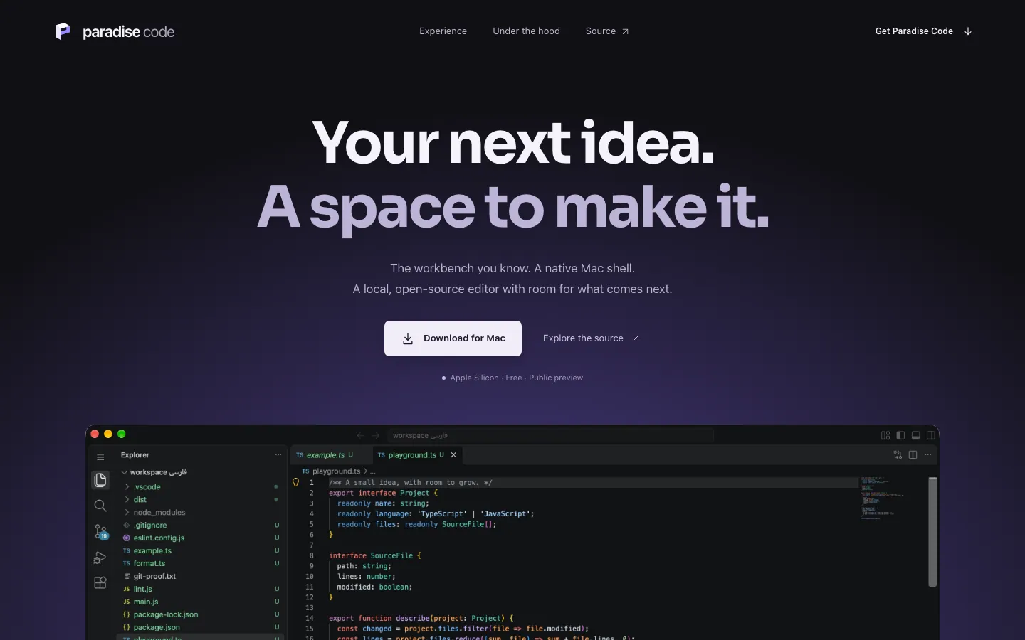
Paradise Code Editor
Your next idea starts here.
- Infrastructure & DevOps
- Product design
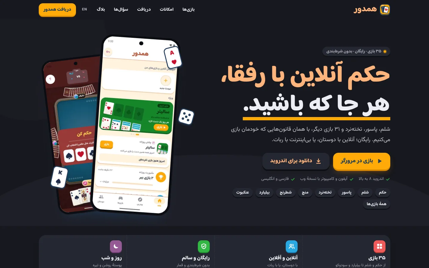
Hamdor
Game night with friends, wherever you are.
- Game
- Mobile app
- Web app or website
What drives the cost?
Design cost depends on the product’s scope and depth, not just the page count. After a discovery session we put the scope in writing and estimate it.
- Number of flows and user roles, not just screens
- A full design system versus a project-level component kit
- Languages and directions: RTL, LTR or both
- How much motion, illustration and 3D the product needs
- Depth of user research and rounds of prototype testing
Frequently asked questions
How much does a UI/UX design agency charge?
Fair pricing isn’t based on page count — a dashboard with ten user roles and dense tables is far more work than ten marketing pages. The main drivers are the number of flows and roles, whether you need a design system, how many languages and directions, and how much motion and 3D. We run a discovery session before estimating, then put the scope in writing. On a tight budget, we suggest getting UX and core components right first and leaving decorative detail for a later phase.
What is the difference between UI design and UX design?
UX design decides how the product works: where users start, which steps they take, how information is organized and where they get stuck. UI design is how that journey looks and feels: color, type, spacing, components and motion. A beautiful UI on a weak UX confuses people, and a good UX with a poor UI fails to earn trust. We do both together, in one team, so they never drift apart between handoffs.
Should we use a template or build a custom design system?
For an MVP or a small site, a ready kit such as shadcn/ui with your colors and type is a sensible choice and gets you to market fast. A custom design system pays off when the product has several areas, teams or platforms and you want each new screen built without redesigning from scratch or drifting off-brand. There is a middle path too: start from shadcn/ui and Tailwind, layer your brand tokens on top, and grow it into a full system later.
What does good RTL design for Arabic and Persian involve?
Mirroring the layout isn’t enough. Directional icons like arrows and “next” must flip, but logos and media controls must not; numbers, phone numbers and code stay left-to-right; mixed Persian or Arabic and English text needs explicit direction handling; and the typeface must join letters without breaks. We use CSS logical properties such as margin-inline so one component works in both directions, and design and test the RTL version alongside LTR rather than as an afterthought.
Will 3D web design slow down our website?
Done carelessly, yes — a heavy three.js scene drains batteries and makes interaction sluggish on mid-range phones. We use 3D only where it communicates better and give it a performance budget: compressed models and textures, deferred loading after the main content, pausing rendering when the scene is off-screen, and a lighter fallback for weak devices and users who prefer reduced motion. The page’s text renders independently of the scene, so search engines see it either way.
What do we receive from a product design engagement, and how is handoff handled?
You get a Figma file with organized components and variables, a clickable prototype, token documentation and every component state, and you own all of it. The bigger advantage is that handoff usually isn’t needed: the same team builds the design in React, Tailwind and shadcn/ui and runs visual QA against it. If you have your own engineers, we hold a handoff session and review their implementation so the design doesn’t erode on its way to code.
Further reading
From Figma to Production Without Design Debt
Most UI debt isn’t a pretty Figma file—it’s missing tokens, forgotten states, and one-off decisions in code. A delivery path that shrinks the design–frontend gap.
Designing Design Systems with Tailwind and HeroUI Without Class Chaos
From tokens and variants to a shared component package—how to turn Tailwind and HeroUI into a product system, not scattered utilities.
RTL-first frontend architecture
Logical properties. A practical guide with a real scenario and execution checklist for RTL-first frontend architecture.